It can be kind of mind-blowing when you see how bad some people are at their jobs.
If most of us screwed up as royally as these people did, we’d probably be pounding the pavement looking for a new gig.
But, maybe everyone deserves a second chance…or a third or a fourth…
The bottom line: take a look at these design fails and be happy you’re not the one responsible for them.
1. I bet that smells bad after a while.
Who’s responsible for this?
These benches at my university are tilted back and have no drainage system, so the water just sits there for up to days after a rainstorm.
by inCrappyDesign
2. Anyone care for some moldy cheese?
Oh, that’s just the packaging? Hmmm…
The paper in this sliced cheese makes it look like it has mold spots
byu/nakisa444 inCrappyDesign
3. Somebody is gonna get hurt in here.
Don’t try it!
A shower designed to be as hard to stand in as possible
byu/hungryhungryharpy inCrappyDesign
4. That’s not secure at all.
Nice try, though.
A “secure” bike shed in Cambridge, UK. The gaps are for ventilation, apparently.
byu/exploreplaylists inCrappyDesign
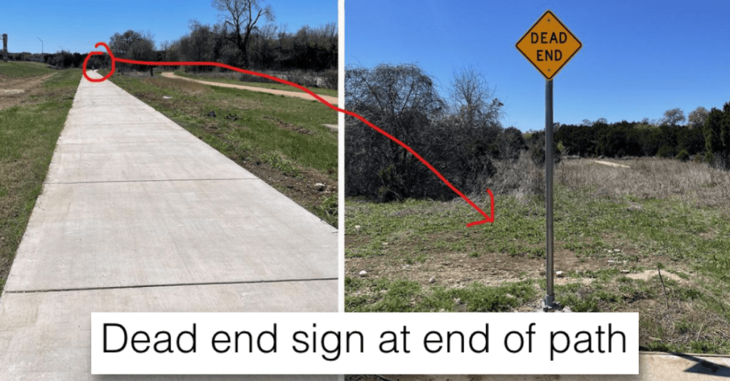
5. Thanks for letting me know this is a dead end…
AT THE DEAD END.
Dead end sign at end of path
byu/double-you-dot inCrappyDesign
6. That disgusting: plain and simple.
Just a bad idea all around.
Again with carpeted bathrooms
byu/your_neighbor420 inCrappyDesign
7. What happened to Grandpa?
He’s turned into a cyborg, honey…
Sandwich board advertising seniors day – unfortunate fastener placement
byu/bycrackybygum inCrappyDesign
8. Let’s have a chat.
So, where are you from? What do you do?
this urinal where you can stand face to face
byu/cldrdad00n inCrappyDesign
9. This is nightmare fuel.
But I can’t look away…
Saw an interesting van coming home from school
byu/Mixaling inCrappyDesign
10. The kitchen is a little tight.
I don’t think you’ll be hosting any dinner parties in there.
Modern living condo for sale. 2 bedrooms 2 bathrooms 1/4 kitchen
byu/SlaughterheartMagus inCrappyDesign
11. Can someone explain this to me?
I’m a little bit concerned.
Is this trophy for golf, or assault?
byu/ki4fkw inCrappyDesign
12. Not a good look.
It looks like some terrible things went on last night.
I thought it was a horribly stained mattress until I focused on the details
byu/dweebiest inCrappyDesign
13. No privacy? No problem!
It’s a party! Come on in! Or just watch from the outside!
Ouch…not good, people…not good at all…
And now it’s your turn!
In the comments, please share some more photos of bad design that you think will make all of us cringe.
Thanks in advance!
