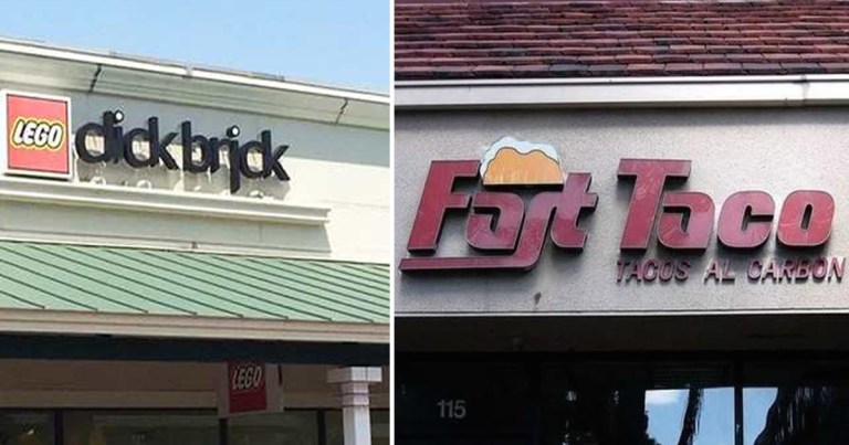
Say you’re starting a business. You need to design your shop’s sign. It’s got to be clear and readable, sure, but you want to stand out. Maybe you want to give off a certain kind of “vibe.” Regular old Times New Roman isn’t going to cut it. So you start looking through fonts. There are … Continue reading 15 Poor Font Choices
