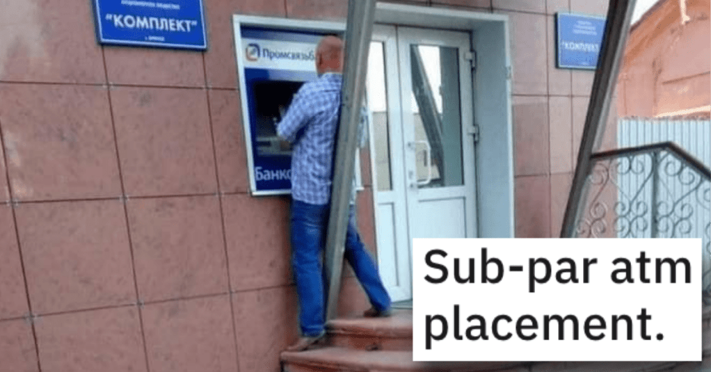
Do you ever look at a building or a poster or a sign or anything really and think to yourself, “hmmm…that really looks like sh*t?”
You know you do! And I do it, too!
It’s kind of mind-blowing that people keep their jobs when they’re so bad at them, ya know?
So I’m here to say that you and I shouldn’t feel bad about thinking that way, because there is bad design all over the place and it’s actually kind of hard to avoid…
And here are some perfect examples of what I’m talking about…let’s take a look.
1. JUST DO NOTHING.
It is impossible.
2. Spoiler alert!
Well, that wasn’t cool…
3. Seems like a great idea.
What could possibly go wrong?
4. That’s not going to help people in their time of need.
I’m just saying…
5. It’s a great publication.
I’ve had a subscription for many years.
6. Not a good idea.
How’s that working out for you?
7. What are you trying to say to these people?
You might be sending the wrong message…
8. I don’t see a 9!
Where is the 9?!?!
9. You screwed it!
Nice job!
10. I don’t see a problem.
Just squeeze right in there.
11. Be careful with that thing!
You’re gonna hurt yourself.
12. That’s not good advertising.
You’re gonna scare people away.
13. I thought it was a drink!
Keep away from children!
Like I said, bad design really is everywhere…
And now we want to hear from you!
In the comments, share some photos of some really awful examples that you’ve seen.
Thanks in advance!
