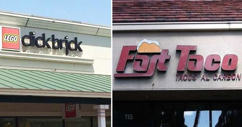
Say you’re starting a business. You need to design your shop’s sign. It’s got to be clear and readable, sure, but you want to stand out. Maybe you want to give off a certain kind of “vibe.” Regular old Times New Roman isn’t going to cut it.
So you start looking through fonts. There are lots of cool ones out there. You find an exotic one that’s just perfect. Done, right? Wrong.
I’m here to tell you to: BE CAREFUL!
Because quite often, as cool as these fonts might be, the way they’re spaced and designed can make perfectly innocent words look much, much dirtier. You don’t want to be the laughing stock of your town, do you?
Here’s what you do. Pick out your favorite sign design, then show it to a few trusted friends or loved ones. If they giggle, go back to the font list and try again. And in the meantime, let this gallery of font fails serve as a cautionary tale.
1. That’s not a nice thing to call your aunt.
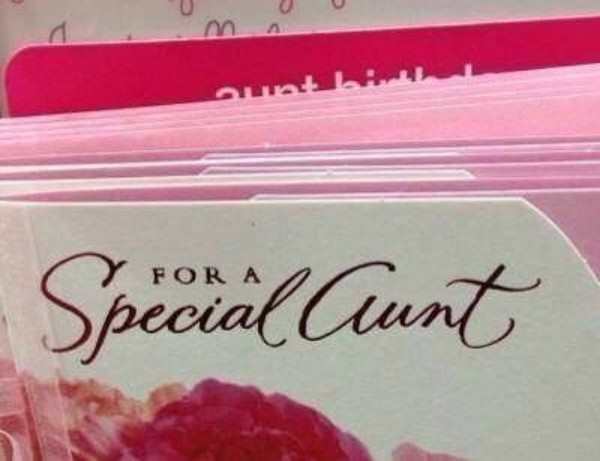
Photo Credit: Pleated Jeans
2. Nobody gets THAT excited about a bathing suit.
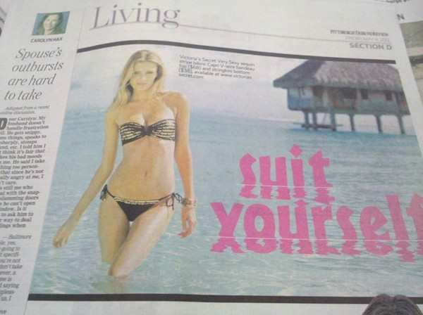
Photo Credit: Pleated Jeans
3. Hey, at least they’re honest.

Photo Credit: Pleated Jeans
4. Well, they’ve done a reality show about everything else…

Photo Credit: Pleated Jeans
5. If my school were like this, I never woulda left.
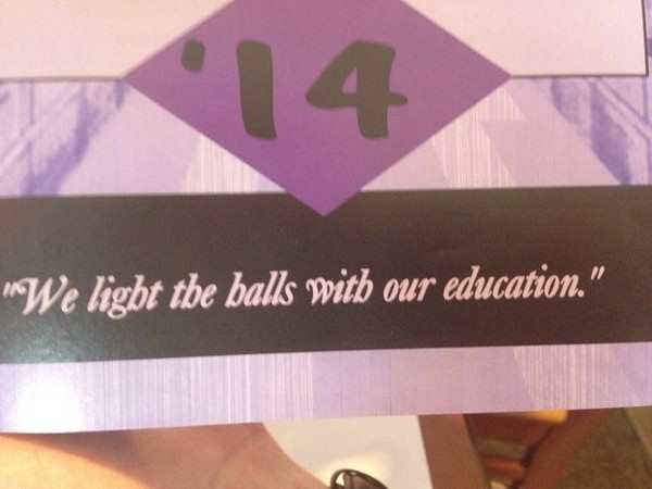
Photo Credit: Pleated Jeans
6. Why just Friday? Why can’t it be every day?
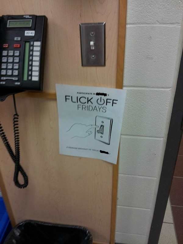
Photo Credit: Pleated Jeans
7. Seriously, if you have the letters and “L” and “I” in your business name, beware.
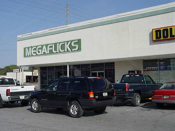
Photo Credit: Pleated Jeans
8. The same goes for the letters “C” and “L”

Photo Credit: Pleated Jeans
9. Lego’s changed since I was a kid.
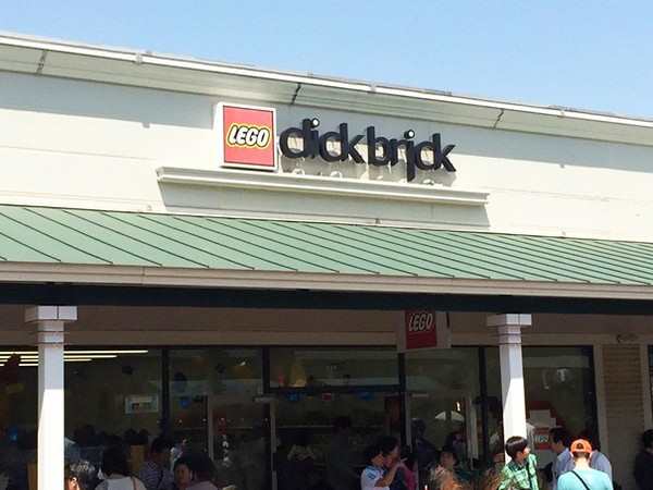
Photo Credit: Pleated Jeans
10. That’s just unsanitary.
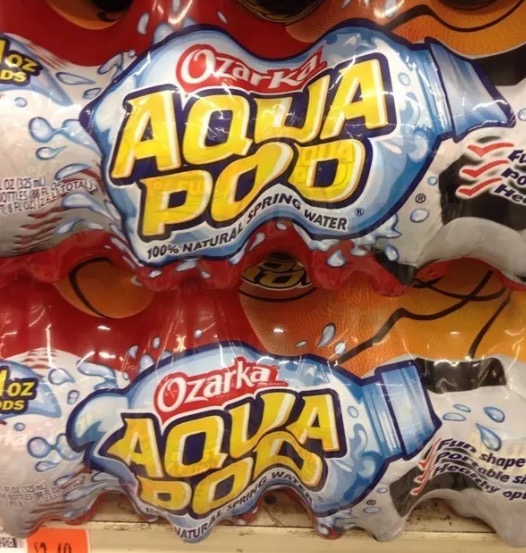
Photo Credit: Buzzfeed
11. They can advertise that now?
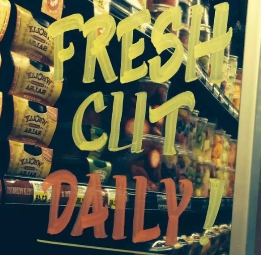
Photo Credit: Buzzfeed
12. This one seems like it would totally work!
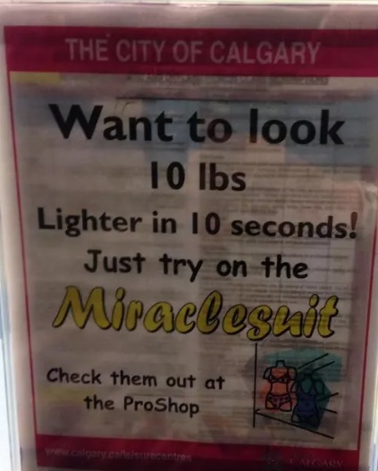
Photo Credit: Buzzfeed
13. And this one might not even be a mistake. Have you ever meet boat people?

Photo Credit: Buzzfeed
14. Hey, whatever get up to with paint, it’s none of my business.
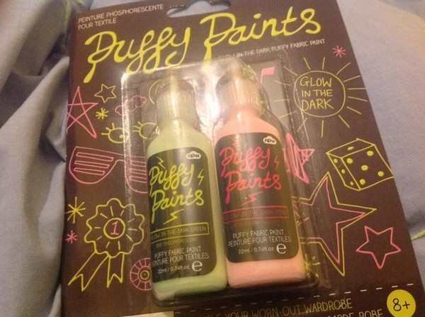
Photo Credit: Pleated Jeans
15. And finally, it looks like young Curt might have a difficult life ahead of him.

Photo Credit: Buzzfeed
h/t: Pleated Jeans
