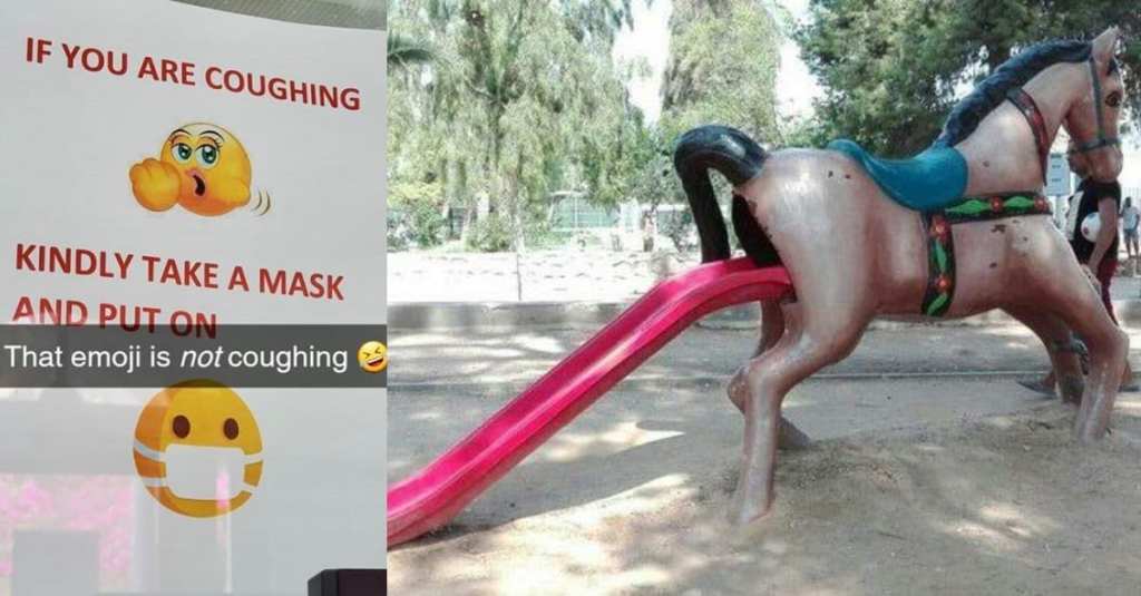
If you’re paying attention, you’ll realize that really bad design is ALL AROUND US.
In public places, in private homes, in business. It’s everywhere.
Here are 16 real whoppers that might make you shake your head in dismay.
1. Bowl o’ dicks.
2. Kids…look away.
3. Thank you for this.
4. Seems kinda dumb.
5. Terrible idea.
6. Incredibly stupid.
7. Come and find out…
8. Just say no…to what?
9. Might be sending the wrong message.
10. Like Boston?
11. A room with a view.
12. What kind of animal is this?
13. Kids, let’s play!
14. Safety first!
15. I know I just called you, but I need your number.
16. Hope you got your money back…
Yowza…NG = Not Good. Not good at all…
Have you seen any really terrible design fails lately? If so, why didn’t you tell us?!?
Oh, there’s a comment section for that. Okay, use that and share that shizzz!
