Whenever a product gets made for mass consumption, it goes through many phases of development. Finishing the product is really just the beginning–it then has to undergo testing, quality assurance, marketing, testing the marketing, and then finally it gets introduced to the public. You really don’t want to skip these steps. Otherwise you might end up with a silly straw that’s as sharp as a razor blade, or a smart phone that shouts out its owner’s medical history non-stop. For example.
Despite all this development, sometimes a product still gets sold with a fatal flaw. (Or, more accurately, these steps weren’t followed in the first place.) It might not be fun to own such a product, but it’s definitely funny to look at them. Here are 15 more design fails making the world a bit more interesting. (via Bored Panda)
1. Just in case the caffeine isn’t enough to wake you up.
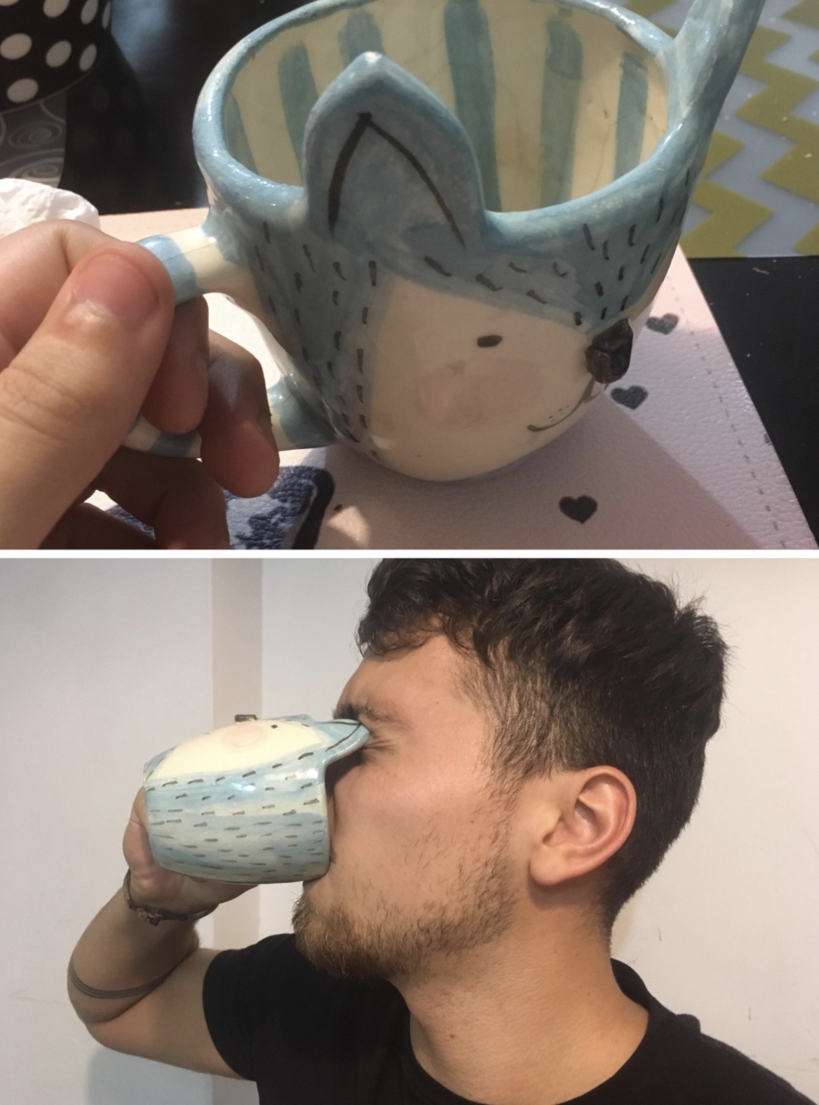
Photo Credit: Reddit
2. Toronto airport bathroom, or a hidden camera prank show?
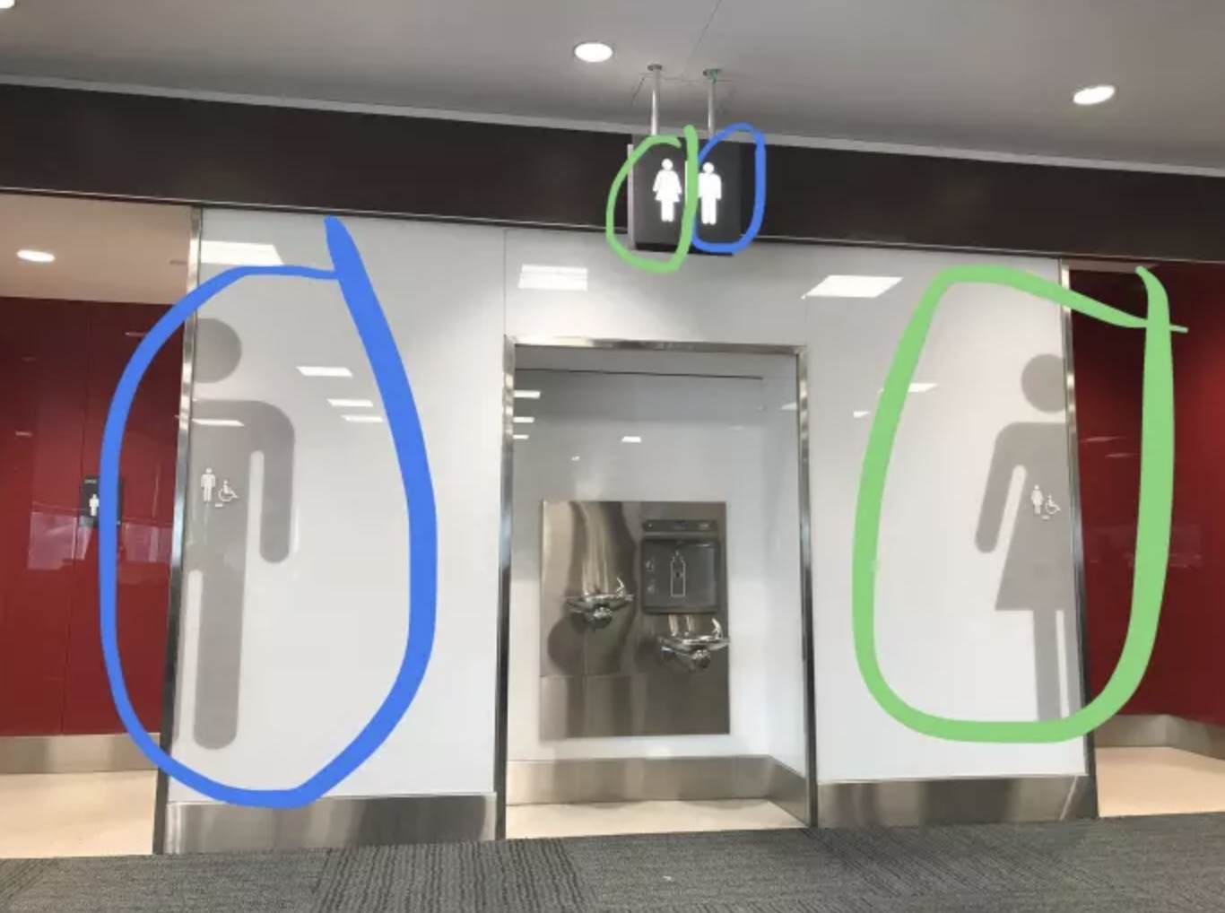
Photo Credit: Reddit
3. Pretty sure your plan has a couple holes, chief.
Gotta include one of these with every card! You’re going to need it after I cut your hair ??Trust me ?? pic.twitter.com/V8XEusCgoe
— jake gamez?? (@gamezjakee) March 10, 2019
4. Something doesn’t add up.
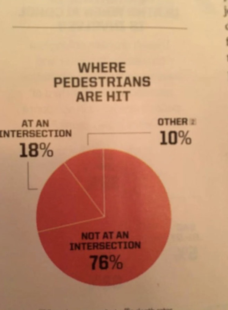
Photo Credit: Reddit
5. The feature article from Not Seeing The Forest For The Trees Monthly
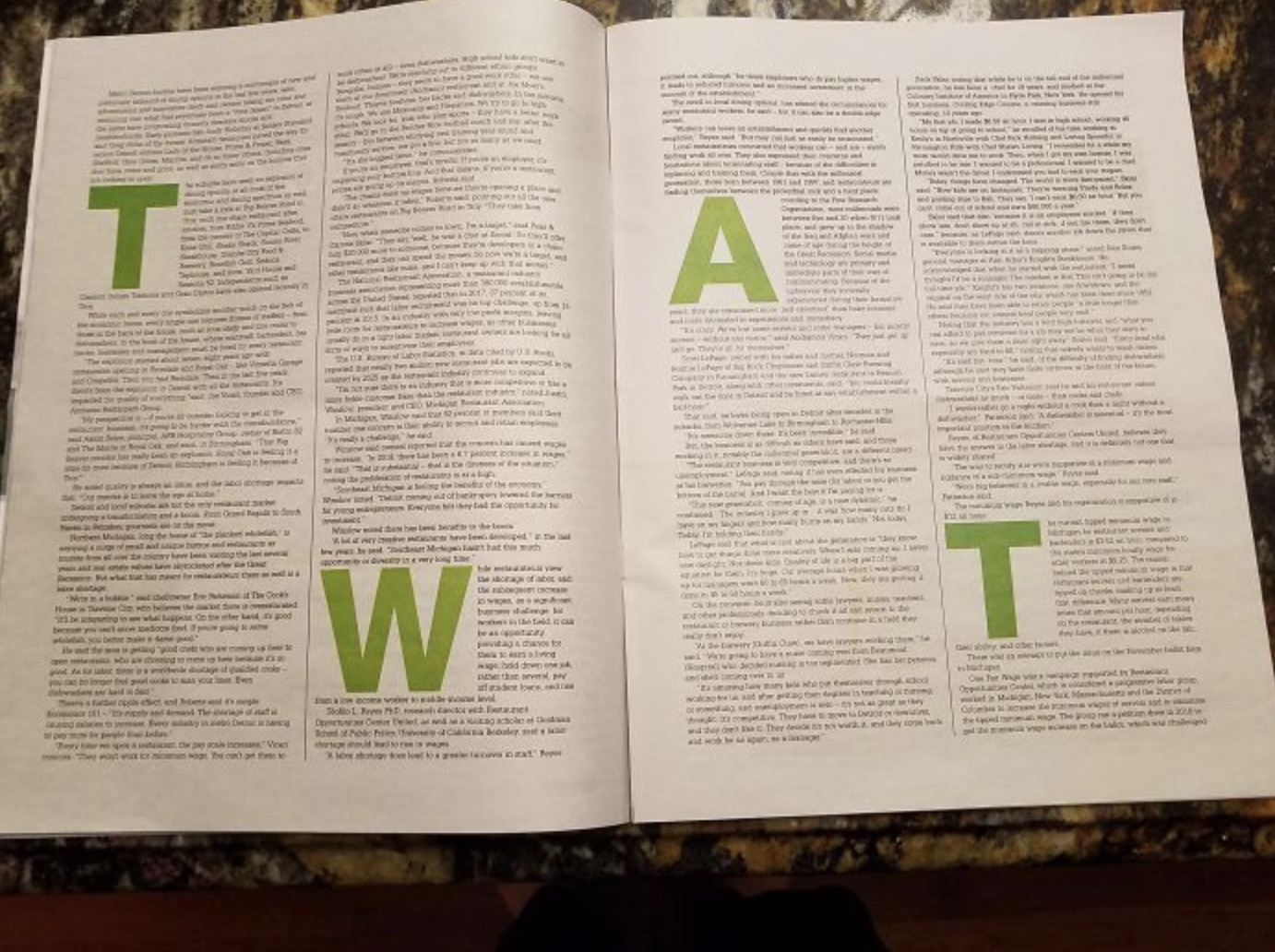
Photo Credit: Reddit
6. This bike path is brought to you by Chrysler.
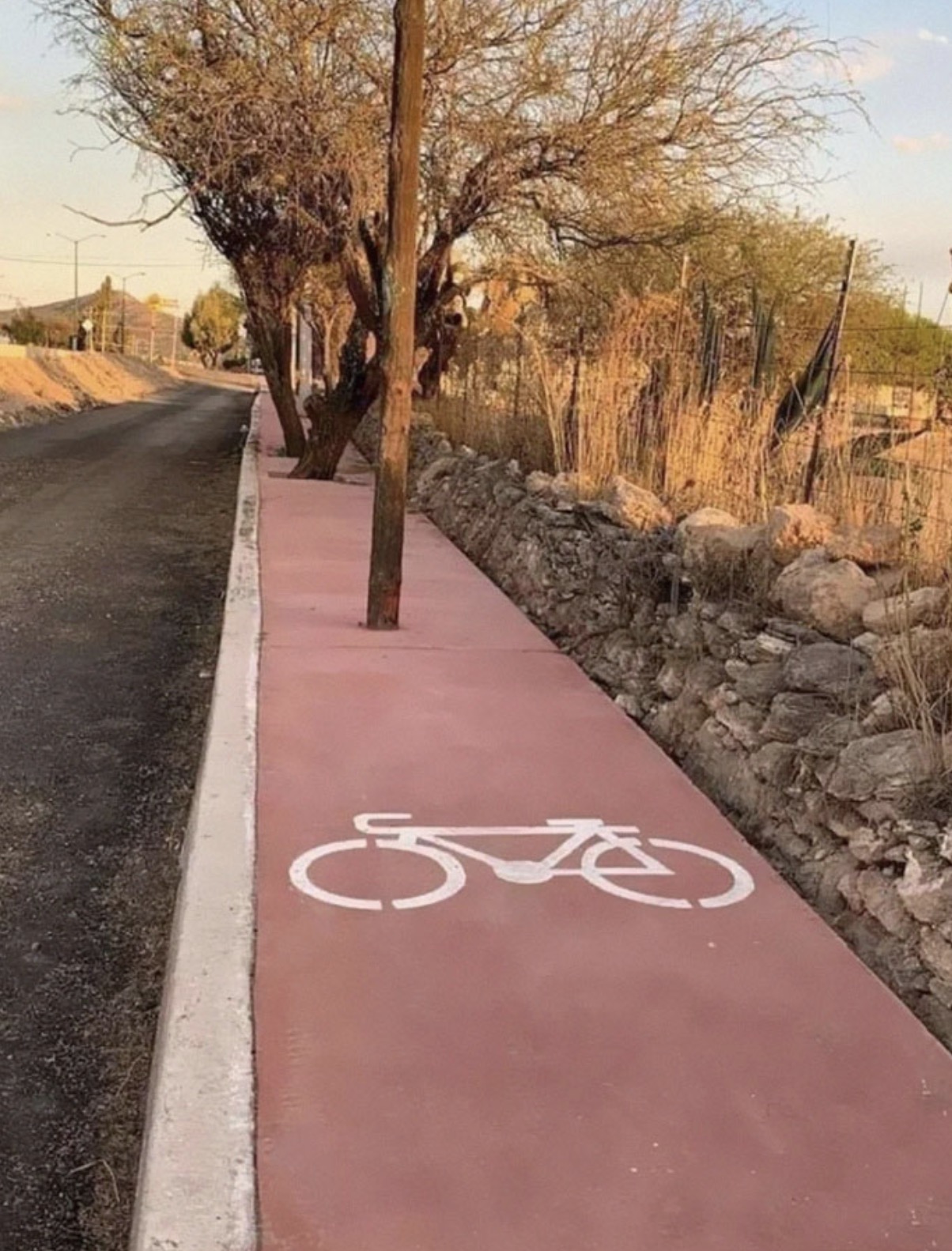
Photo Credit: Reddit
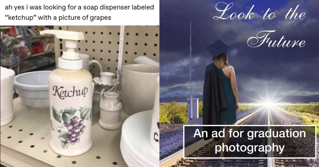
7. The soap dispenser with identity issues.

Photo Credit: Reddit
8. Punctuation saves lives.
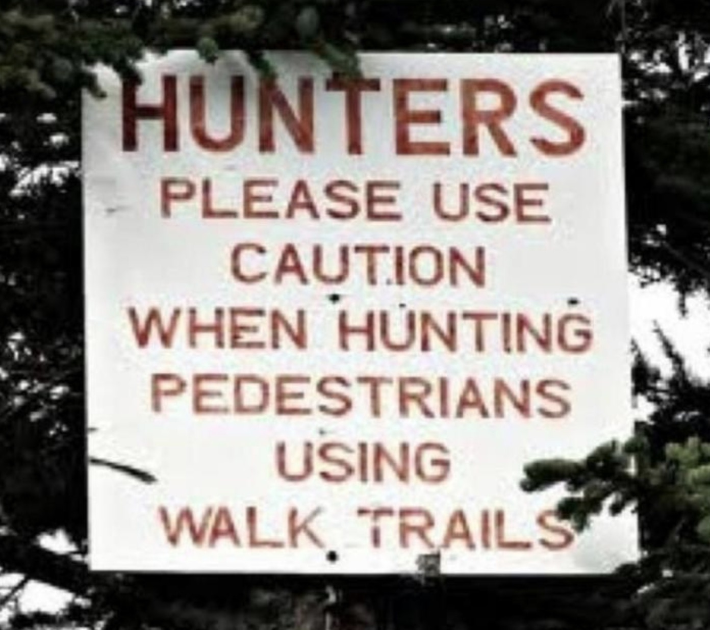
Photo Credit: Reddit
9. What does the milk say? Moooooo.
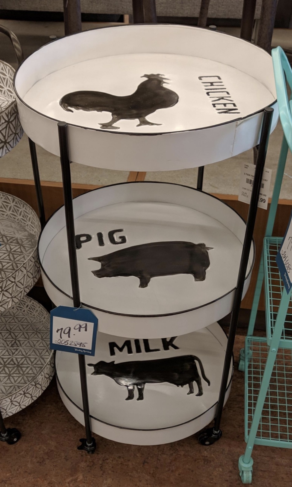
Photo Credit: Reddit
10. That’s…actually a better metaphor for graduation than what they intended.

Photo Credit: Reddit
11. And that’s why I never buy used books.

Photo Credit: Reddit
12. From the people who brought you space saving furniture, it’s: space wasting furniture.

Photo Credit: Reddit
13. Christian Life International wanted to find ways to bring in young people.
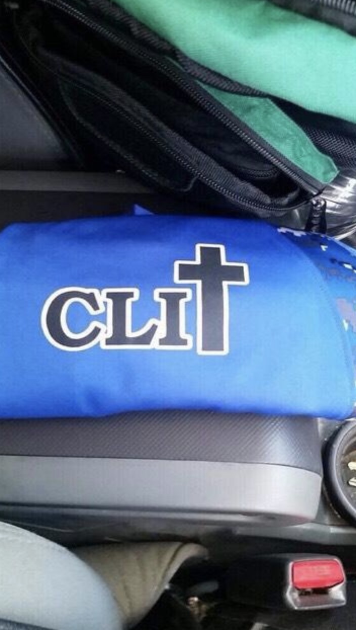
Photo Credit: Imgur
14. Is that an automated trash can in your pocket or are you just happy to see me?
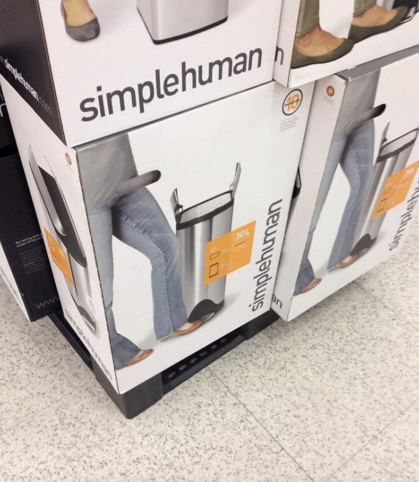
Photo Credit: Reddit
15. This sign gave me a migraine.
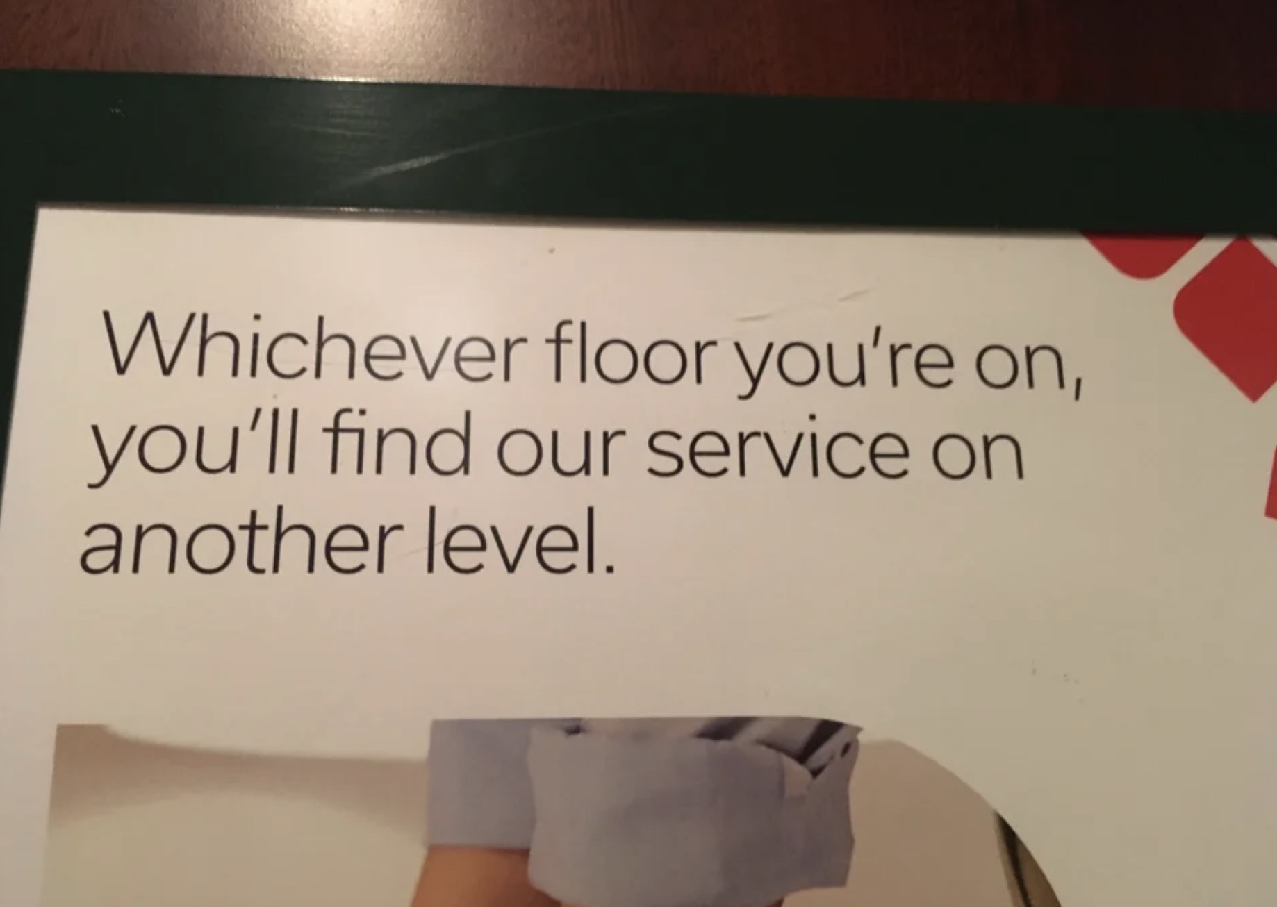
Photo Credit: Reddit
h/t: Bored Panda
