Have you ever seen a logo for a company that was just atrocious and waaaaayyyyyy off the mark?
It kind of makes you feel sorry for the folks who came up with it, but, hey, that’s business, baby!
These business logos definitely belong in the FAIL category.
1. Stanger danger.

Photo Credit: Sad and Useless
2. Looks like…never mind…

Photo Credit: Sad and Useless
3. On fire down below.

Photo Credit: Sad and Useless
4. Missed the mark.

Photo Credit: Sad and Useless
5. What does that look like?

Photo Credit: Sad and Useless
6. Oh, boy…

Photo Credit: Sad and Useless
7. Yikes. That’s a penis.

Photo Credit: Sad and Useless
8. Looks like he’s having a good time, at least.

Photo Credit: Sad and Useless
9. Looks painful.

Photo Credit: Sad and Useless
10. Not a good look at all.

Photo Credit: Sad and Useless
11. Lost my appetite.

Photo Credit: Sad and Useless
12. This is amazing.

Photo Credit: Sad and Useless
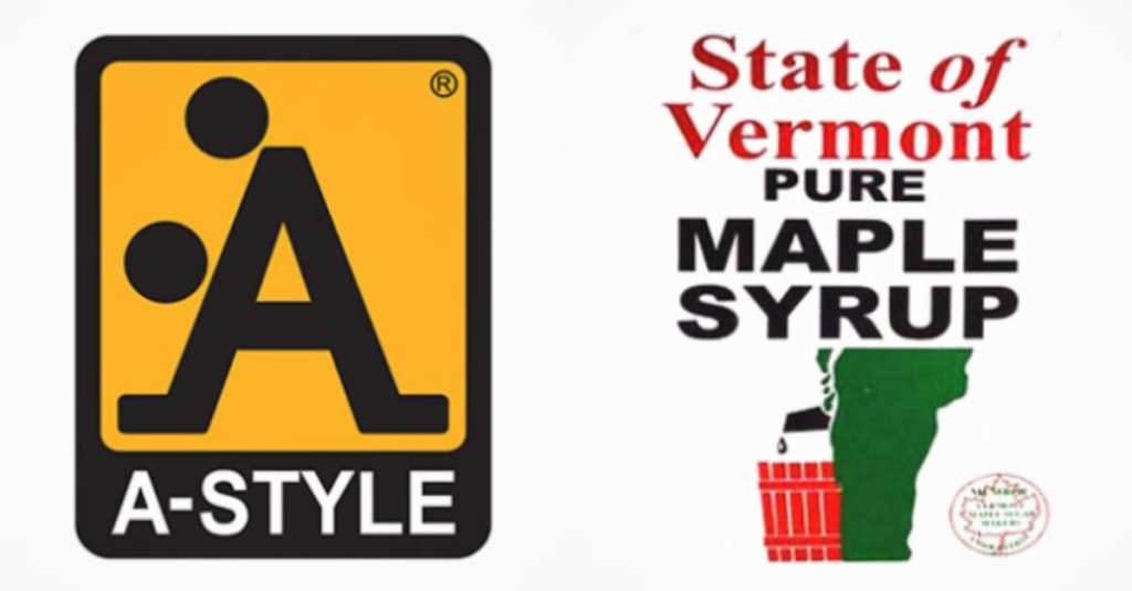
13. Need those spaces.

Photo Credit: Sad and Useless
Yikes…I wonder if any of these companies are still in business…
Have you seen any truly bad business logos and happened to snap a pic?
Please share with us in the comments. We’d love to hear from you!