Some folks got it and some folks don’t.
I’m referring to design skills of all kinds and, if you’ve bothered to open up your eyes at any point lately, you’ve definitely noticed that there is A TON of bad design out there. And I’m talking about all kinds of different things.
It’s kind of amazing that some people get paid big bucks for the things you’re about to lay your eyes on.
And it certainly is a sad state of affairs…
Let’s look at the evidence.
1. Who’s responsible for this?!?!
Really dropped the ball on this one.
2. It’s like an obstacle course.
Who’s ready to have some fun?!?!
3. Looks a little bit off to me.
Do you see it?
4. Do that in the privacy of your own home, please.
Some things should be private.
5. Looks like a lot of fun!
But the ball doesn’t bounce too well…
6. Cover your nose!
Come on, people!
7. Isn’t that ironic?
You better sleep with one eye open.
8. I’m seeing some foul language on that mask.
Don’t wear that out in public!
9. Is this cheese expired?
The green is not a good look.
10. An epic fail, if there ever was one.
Oh, boy…
11. Don’t drink the shampoo.
Some people, I swear…
12. Some very poor design.
Well, I guess you can wear those snow boots in the summer.
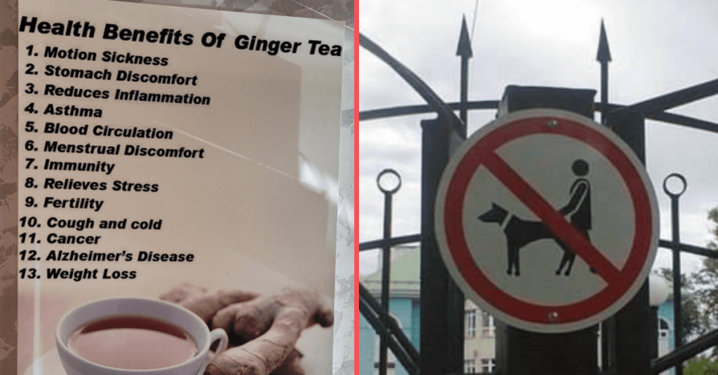
13. All these great health benefits!
Drink it up!
Now it’s your turn!
In the comments, tell us about some examples of really bad design that you’ve laid your eyes on.
And share some photos, too, please! Thanks!
